What Are the Top Computer Graphic Design Images in 2026?
Computer Graphic Design Images in 2026 will be shaped by a practical tension: audiences want visual freshness, while brands need consistency and trust. Expect editorial-style 3D scenes, tactile textures, bold typography, and images made for vertical screens. A soft shadow beneath a product, a grainy gradient, or an imperfect paper edge can make a digital layout feel more human. But novelty alone is not a strategy.
The Canva Visual Economy Report 2023 found that 92% of business leaders believed employees with design skills were more likely to be successful. That figure points to a wider business need: visual communication is not merely decoration. Adobe’s Creative Trends research also tracks changing audience preferences and creative directions, reminding teams to test visual choices rather than follow trends blindly. Reports describe broad patterns, not guarantees. A style that works for a beauty campaign may confuse a financial dashboard.
Graphic designer Milton Glaser offered a useful design test: “There are three responses to a piece of design—yes, no, and WOW! Wow is the one to aim for.” For 2026 images, that “wow” may come from a clear focal point, a memorable color pairing, or an unexpected crop—not extra effects. Small details matter. So does restraint. Some images will look polished yet feel strangely empty; that is worth admitting. This guide explores the visual directions gaining attention, what makes them useful, and how to judge whether they fit a real project.
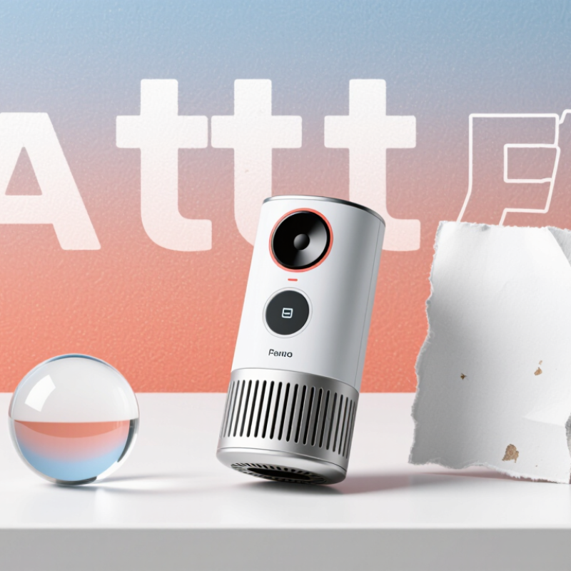
Defining Computer Graphic Design Images in 2026
In 2026, computer graphic design images are visual assets created or refined with digital tools to communicate an idea, guide attention, or shape an experience. They include vector illustrations, edited photographs, 3D renders, interface graphics, and mixed-media compositions. A file is not a design simply because software produced it. Intent matters: a soft blue gradient may calm a health guide, while sharp contrast can make instructions easier to scan.
The image’s structure matters too. Raster artwork stores pixels and suits detailed photographs; vector artwork uses scalable paths and stays crisp on screens of different sizes. Designers often combine both, then check color, contrast, crop, and readability at actual display sizes. Details matter. A tiny label that vanishes on a phone can weaken an otherwise polished graphic. In practical workflows, keeping editable layers and noting major edits makes revisions clearer and supports a more reliable handoff.
Creation methods are also changing, but the definition should stay tied to purpose and craft, not novelty. Some images may begin with automated tools, then need human review for accuracy, visual hierarchy, and accessibility. A beautiful result can still mislead if its context or alterations are unclear. That boundary is not always neat. Designers should consider where an image will appear, who needs to understand it, and whether its details remain honest when resized, compressed, or viewed without color.
Key Visual Styles Shaping Graphic Design
In 2026, graphic design is moving between tactile warmth and digital depth. Expect grainy paper textures, oversized type, vivid color clashes, and polished 3D objects. These styles make screens feel less sterile. A soft shadow beneath a chrome shape can add depth; a rough edge can keep the image human. Motion is also becoming part of the visual language, especially in social graphics and short campaigns. But more effects do not always mean more clarity. I still see layouts where the decoration wins and the message gets lost.
A useful measure is whether visuals help people understand. The 2024 Visual Economy Report found that 92% of business leaders considered visual communication important to business. That finding supports a practical point: style should serve the information, not bury it. Designers can pair expressive imagery with clear hierarchy, generous spacing, and readable contrast. AI-assisted image tools may speed up exploration, but human review still matters. Hands, lettering, and small details can look subtly wrong.
Tips: Build a small mood board with three textures, two type styles, and one accent color. Test it at phone size. Keep the strongest image; remove anything that competes with the headline. Some experiments will feel awkward. That is useful feedback.
What Are the Top Computer Graphic Design Images in 2026?
Key visual styles shaping graphic design, ranked by an editorial prominence score.
The scores are a qualitative editorial assessment on a 0–100 scale, not survey results or market-share figures. They compare the visibility of recurring visual approaches, including expressive typography, dimensional imagery, and retro-inspired palettes.
Popular Image Categories Across Digital and Print Media
In 2026, popular computer graphic design images serve different jobs across screens and print. Social posts favor bold typography, close-up product illustrations, and vertical layouts that remain legible on small phones. DataReportal’s Digital 2024 Global Overview counted 5.04 billion social media user identities worldwide. That scale helps explain the demand for adaptable image assets, though reach alone cannot predict which visuals will perform. Websites often use clean icons, editorial illustrations, and subtle gradients; posters and brochures still benefit from strong contrast, clear focal points, and generous margins.
For print, consider realistic textures, layered collage, and detailed infographics—but check image resolution and color output before production. A graphic that looks crisp on a bright screen may print muddy. Digital campaigns need flexible crops and accessible contrast, especially when images include text. Trends shift quickly, and a polished style can become generic. That is easy to overlook.
Tips: Build one master image, then test phone, desktop, and print versions. Keep key text away from crop edges. For print, request a proof; screen previews are not enough. These choices are practical, not universal—audiences and production methods differ.
How Designers Create and Evaluate Graphic Design Images
What Are the Top Computer Graphic Design Images in 2026?
How Designers Create and Evaluate Graphic Design Images
Strong graphic design images in 2026 do more than look polished. They guide attention, communicate a clear idea, and work across different screen sizes. Designers may combine bold typography, layered illustrations, subtle texture, and restrained motion. A useful process starts with the audience and the image’s purpose. Then designers sketch several layouts before refining color, spacing, and detail. I often find that a crowded first draft feels exciting, but reads poorly on a phone. That is worth noticing.
Tips: Check the image at full size and as a small thumbnail. Ask someone unfamiliar with the project what they notice first. If the answer differs from your goal, adjust the hierarchy. Keep text readable, and leave enough empty space.
Evaluation takes more than personal taste. Designers can compare versions for contrast, legibility, balance, and consistency with the brief. They should also check how colors and fine details appear on different displays. A striking image can still fail if its message is unclear or its text blends into the background. Feedback helps, but it is not perfect; reviewers may bring different assumptions. Record what changed and why. That makes later decisions easier to explain, and exposes habits that need rethinking.
Where Leading Graphic Design Images Are Used in 2026
In 2026, leading graphic design images appear wherever people make quick decisions: online shops, mobile apps, workplace screens, and public displays. Product pages use clean cutouts, close-up textures, and simple comparison graphics to make details easier to judge. On small screens, bold shapes and clear contrast matter more than tiny decorative elements. Keep the focal point obvious. A crowded image can lose its message before someone finishes scrolling.
Social campaigns favor flexible image systems that can shift between a square post, a vertical story, and a wide screen. Motion can help, but it should not carry information that still images need to communicate. Not every image needs motion. In presentations and dashboards, restrained diagrams and annotated visuals help people scan complex information without reading a wall of text. Educational and public-service materials also rely on clear icons, readable labels, and thoughtful color contrast. Test designs at their actual display size; a label that looks crisp on a large monitor may vanish on a phone. Trends change, and visual polish can be overvalued. Sometimes the most effective image is still a little plain.